What I have always loved about being in the computer technology field is the constant learning. Technology is constantly changing with new advances and new consumer demands. And it doesn’t matter how old I get; I see myself always learning and trying something new. I’ll never forget a student I met in the STEM lab while at Edmonds College. She was in her 70s. I was blown away when I heard she was studying astrophysics. That’s the type of person I aspire to be.
My three and a half years at DIRECTV as a content writer were excellent for expanding my mental horizons. I’ve always been a writer, but writing words to improve the user experience when using a website beyond “Push Here!” was a whole new perspective.
UX Writing
Writing for UI/UX differs significantly from writing books, articles, posts, and technical reviews, especially in a Twitterized, Instagrammed, and TikToked world. Attention spans are short; anything read on a webpage must be short, sweet, to the point, and appealing. I have Microsoft’s Manual of Style, the foundation of DTV’s content styling, and The Chicago Manual of Style, the biggest book on my bookshelves. I learned a lot by researching what other sites are doing and by writing detailed prompts in ChatGPT. I also read a lot on baymard.com, uxwritinghub.com, and the Nielsen Norman Group site at nngroup.com. However, one book I highly recommend is “Strategic Writing for UX” by Torrey Podmajersky, published by O’Reilly. I plan on writing a book review for it.

Accessibility
I learned a lot about accessibility testing and how important it is to ensure that the website can be used by people with physical challenges. (Thank you, Terri Hawkins.) One of the services we use is Level Access, which provides automated and manual accessibility testing. They have a plugin that works with all the major browsers. I also learned how to use the Mac Accessibility tools to read and navigate what is on the screen. Did you know you can be fined for not ensuring your website meets government accessibility standards? You can learn more here: W3C Web Accessibility Initiative.
Figma
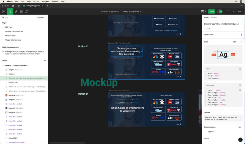
Wow! This is one of the most amazing tools I have ever come across. I’m tempted to return to college for some courses to become a UX Designer. This is how excellent this product is to use. Figma is a collaborative cross-platform interface design tool. DTV has standardized all of its website design work with this tool, and they’re implementing their internal design system library called Fusion. I got involved with the migration and implementation process by writing training guides, recording training videos, and analyzing various Figma plugins for content management. I learned how to prototype and create animated mockup designs to simulate how various website components function.

Keep Learning
Learning is living! Don’t be afraid to tackle something new.

