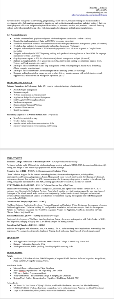
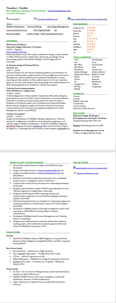
I updated my resume last week with my new skills, education, and projects. It was in the typical text-only format in Microsoft Word. Which is also just a boring text-only format that I have been using throughout my career. Having a semester of graphic arts made me decide that I need to do something a little different.
I also stumbled across this awesome video on Youtube while checking out web development videos. It’s called, “The Resume That Got Me Into Microsoft” by a young Microsoft Intern who does a lot of videos, blogging, and podcasts about programming. (His channel is TechWithTim.) I liked his formatting and it gave me some ideas.
At a quick glace, which one would you rather look at?
The Old Format

The New Format
I hope you said the one on the bottom. Unfortunately, many recruiting firms still want a straight text format. They have sophisticated AI routines that scan the resumes for keywords, skills, and experience. They don’t even read the resume until it gets flagged by their internal search engines if they have a client to match up with.
So, I’ll still keep and maintain my resume in both formats. I am curious to see if this makes any difference in my search for clients. I’ll be sure to post my results in a few weeks.
You can download the new resume here or via the link on the main menu. Thanks for looking.


