The CEPAR Style Guide
I am very pleased with how this Finals project for my semester of Graphic Arts turned out. The assignment was to build a twelve-page style guide with the following elements:
- Cover Page
- Student Profile
- Table of Contents
- Company Overview
- Company Statement
- Brand Identity Logo
- Logo Use Guidelines
- Company Voice and Personality
- Poster Design
- Company Templates for Business Card
- A Sample Company Form
- A Creative Back Page
While this was supposed to be for an imaginary business, I decided to base this on a business and website idea I came up with several years ago. In fact, I took advantage of this course, to focus on defining the voice and brand for the business.
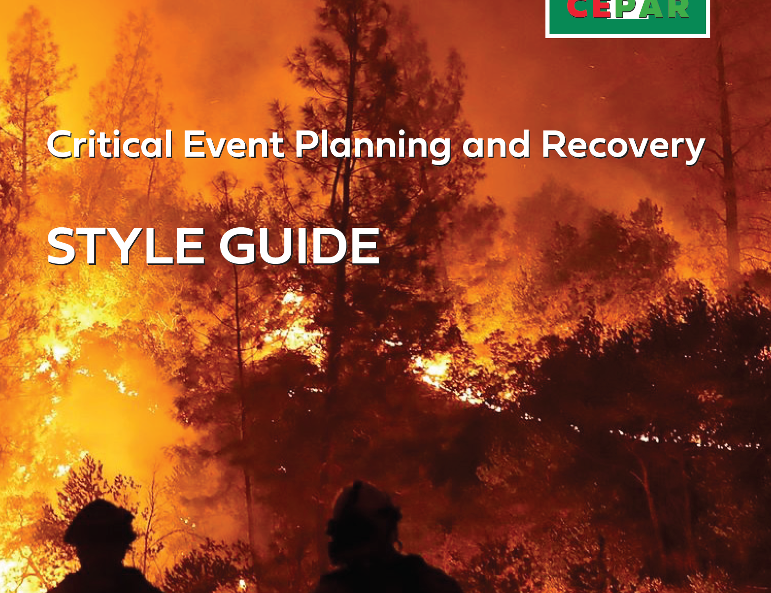
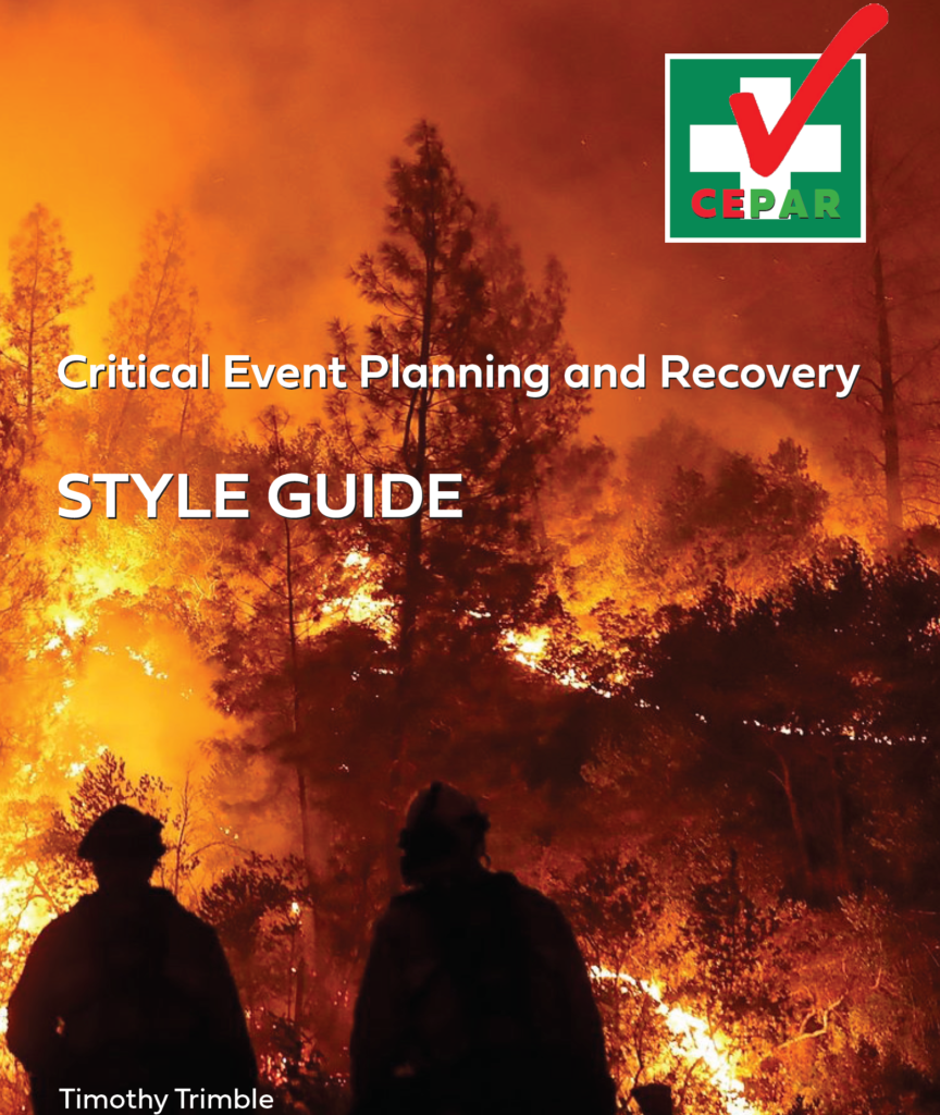
Critical Event Planning And Recovery Style Guide
Feel free to download and examine this PDF file. All I ask is please do not steal my plan for this business. I am in the process of creating the website and building the web-based application to drive it. I’ll be covering my progress in my blog postings on this site.

Lessons Learned?
This course taught me a lot about the process of creative graphic design. It made me step outside of my normal comfort zone and it taught me a lot about styles, trends, and appeal. I have always been a very curious person and I love learning new things. In order to be a good full-stack web developer, I truly believe it is necessary to have a fundamental grasp of graphic design. I have also learned that as is the same with writing code if you try to cut corners to save time, it will show. In code, it shows in the amount of debugging and fixes required to fix the code. In graphic design, it becomes very visible to the eye.
Can you see where I got a little sloppy trying to save some time?
On the second page, bottom right corner, I added my signature initials – a brand mark that I use on all my blog postings. Well, the graphic was initially designed for black on white. In order to get it to match the scheme of the page, I added a green background. I ran out of time and left it the way it turned out. Unfortunately, the residual white aliasing can still be seen and it makes it look sloppy. And yes, I got dinged by the instructor. If I had spent an extra half-hour on it, it would have looked a lot better. While the entire magazine turned out quite well, for me, that little issue is like putting a black dot in the middle of a white page. 😉 And yes, I will be fixing that issue before I turn this into an official style guide for the business.
Feel free to comment on this and let me know what you think about the CEPAR Style Guide. And look for my soon-to-be posted blog entry about my progress with the CEPAR website and development of this new business.
